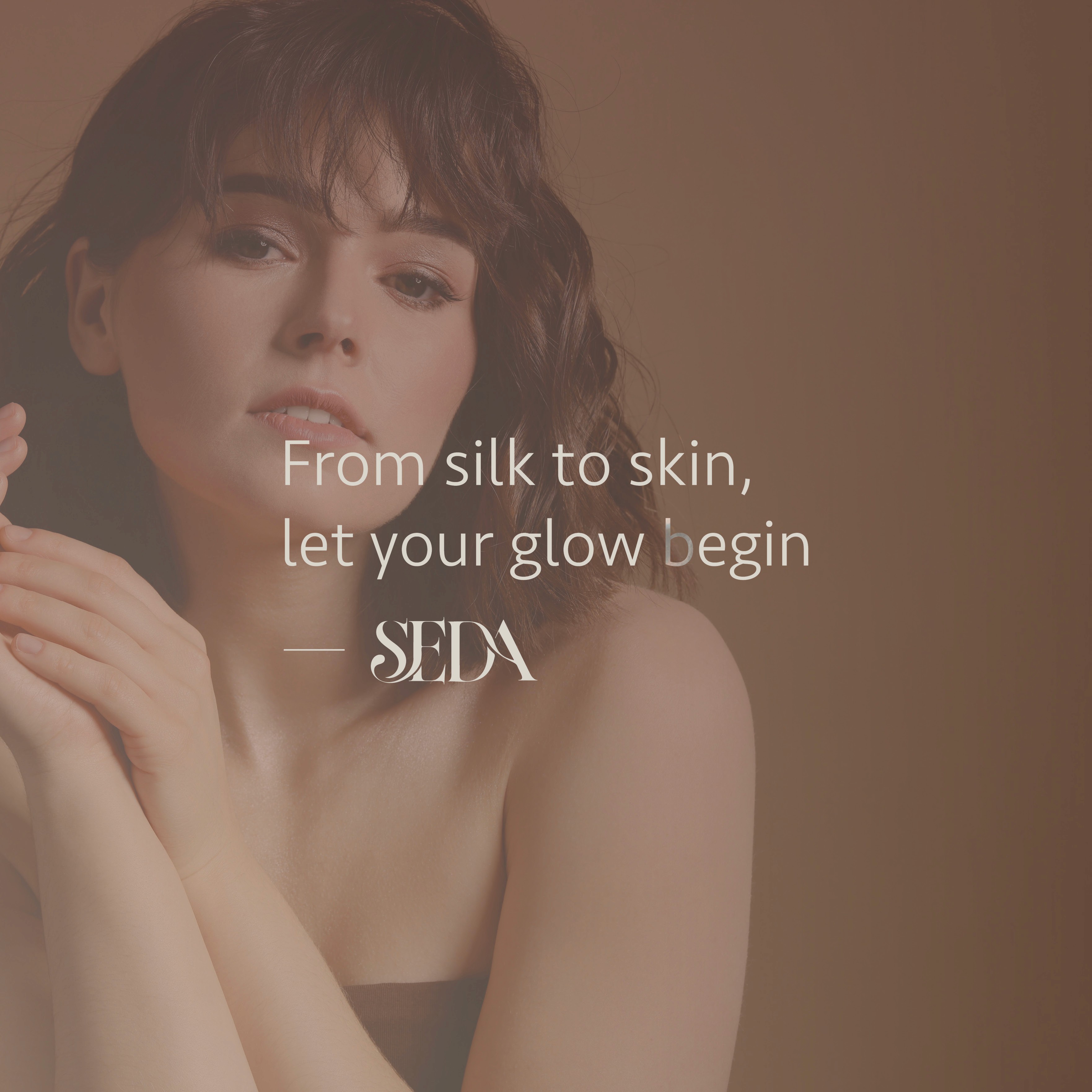
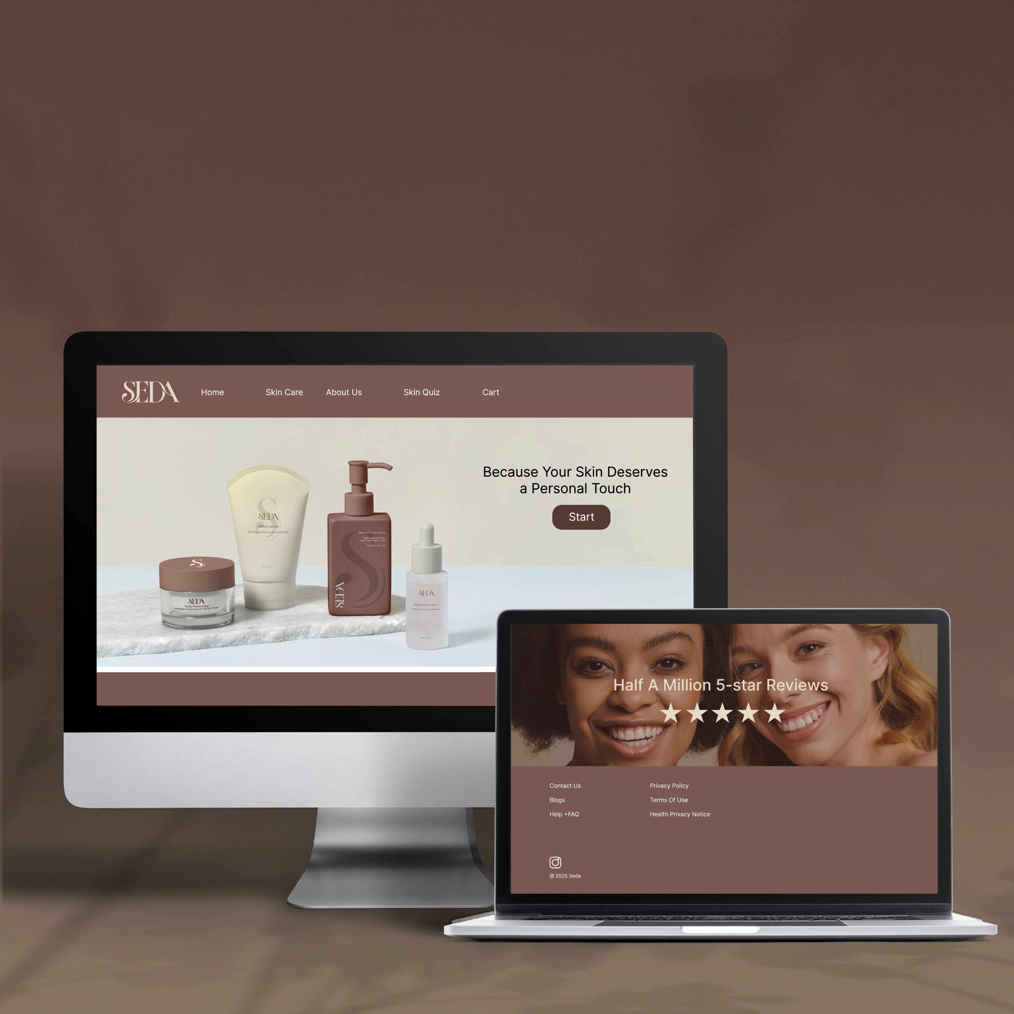
This project is a campaign for Seda Ski Care Cosmetics designed to introduce it in an oversaturated beauty market. The campaign includes social media, a mobile app, a website, and product packaging. Social media content includes posts, and an app to guide users to an interactive quiz. This quiz is designed to help them discover their personalized Seda skincare routine. Skincare can often feel overwhelming with many users struggling to find products suited to their needs. The website mirrors the app experience and allows users to complete the quiz, explore their recommended routine, and purchase products directly. The Seda logo and branding are consistent. The flowing wordmark is inspired by the smooth and silky. The “S” flowing into the “E” and the “D” flowing into the “A”. The “S” also serves as a secondary decorative element used throughout packaging, digital platforms, and marketing materials.