Design Concept
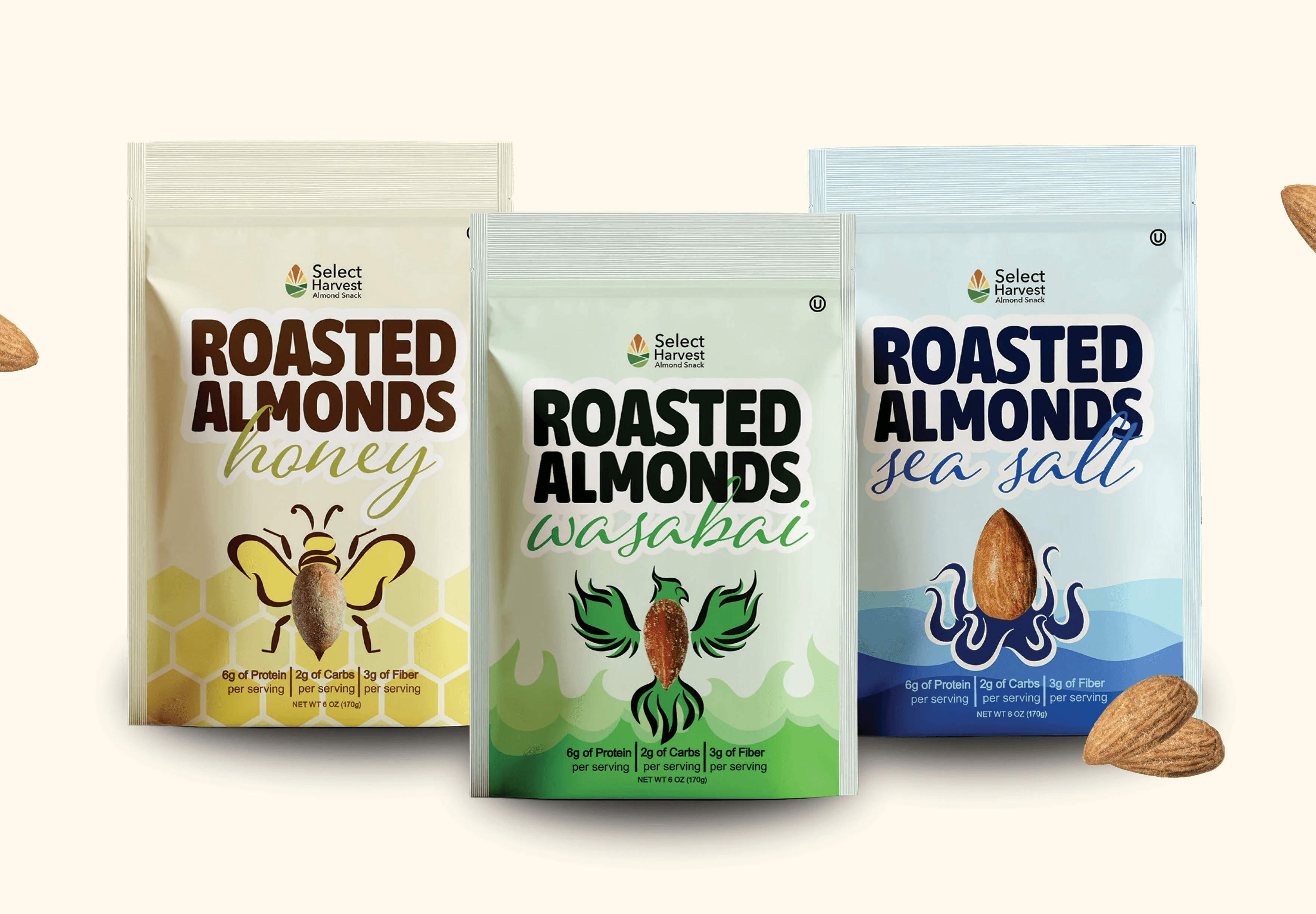
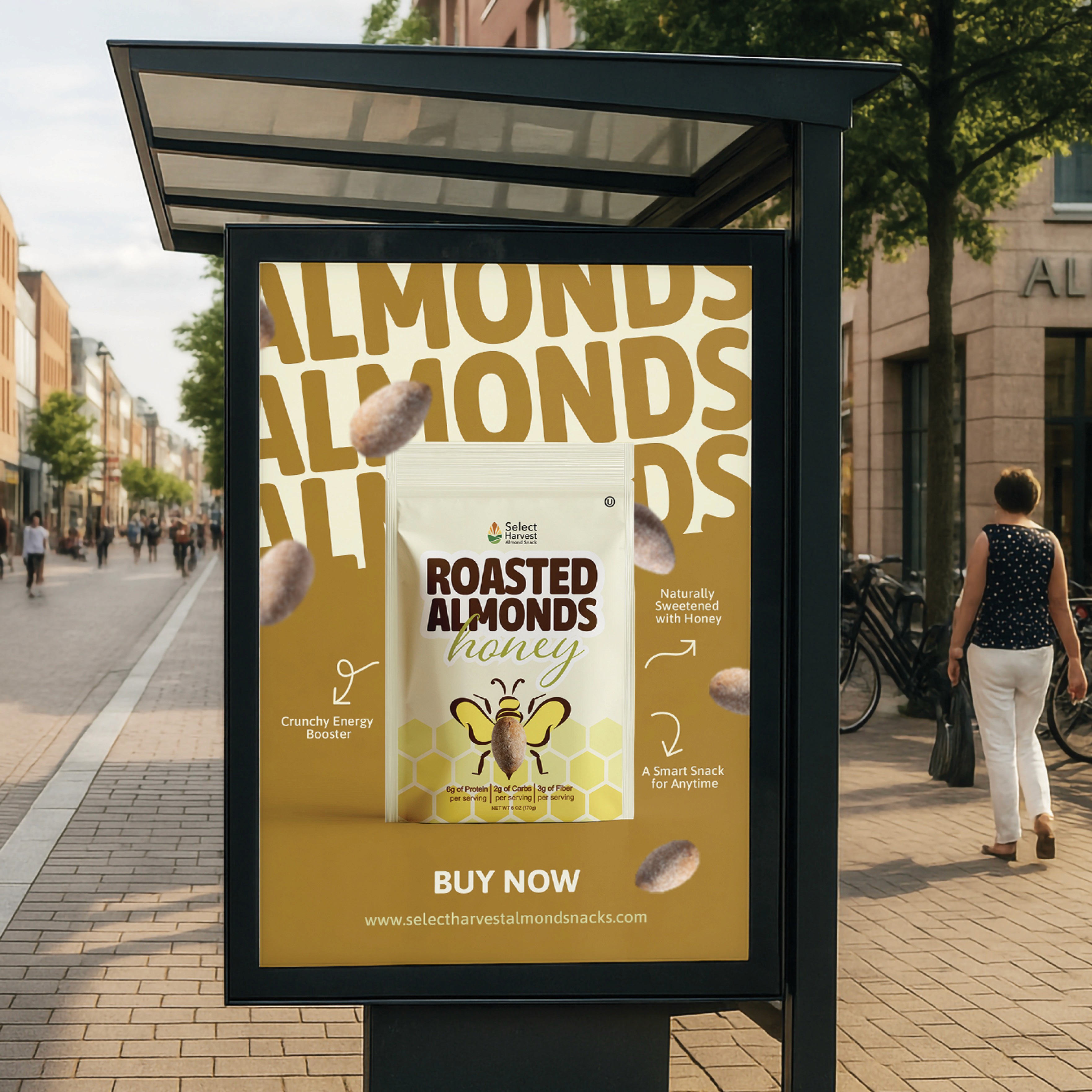
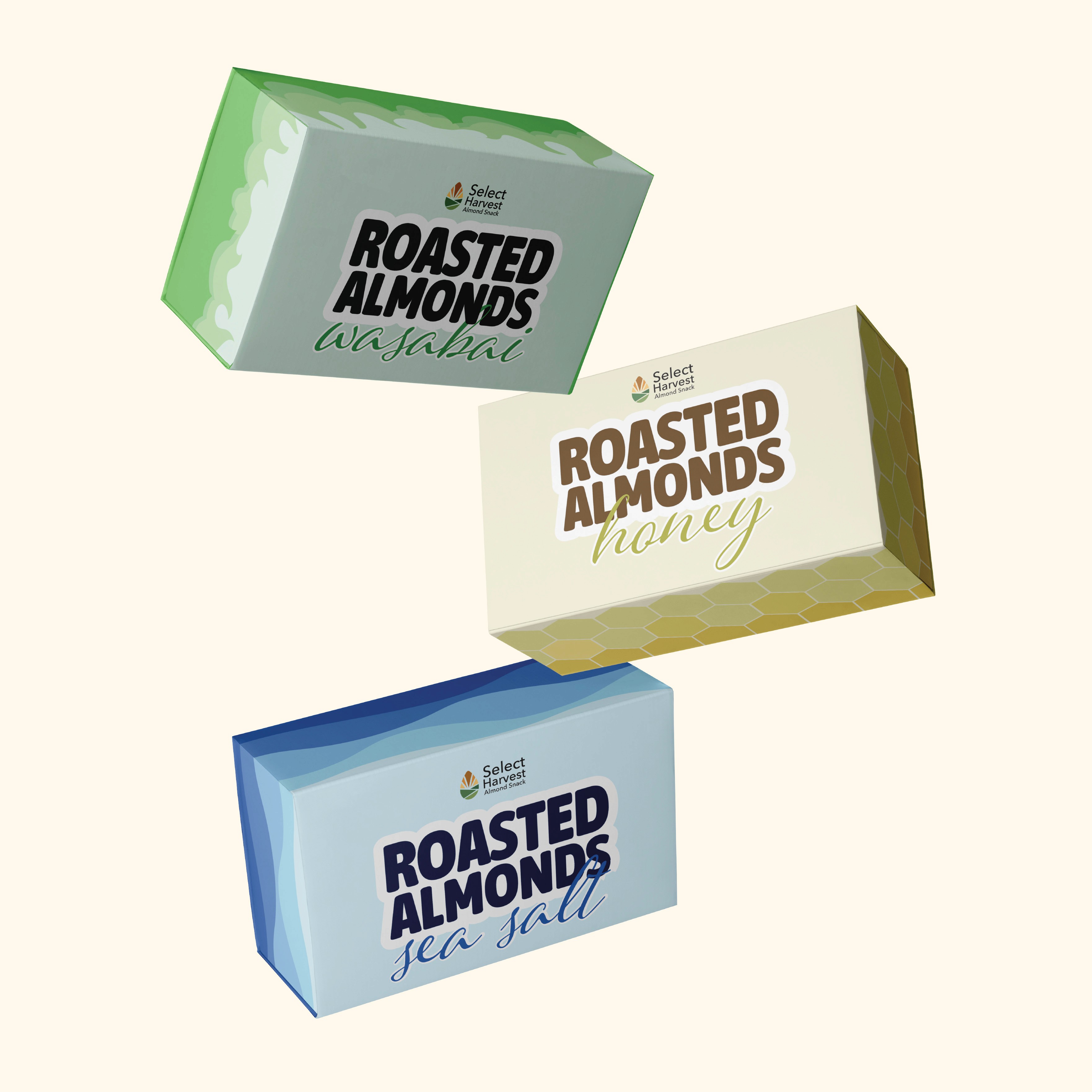
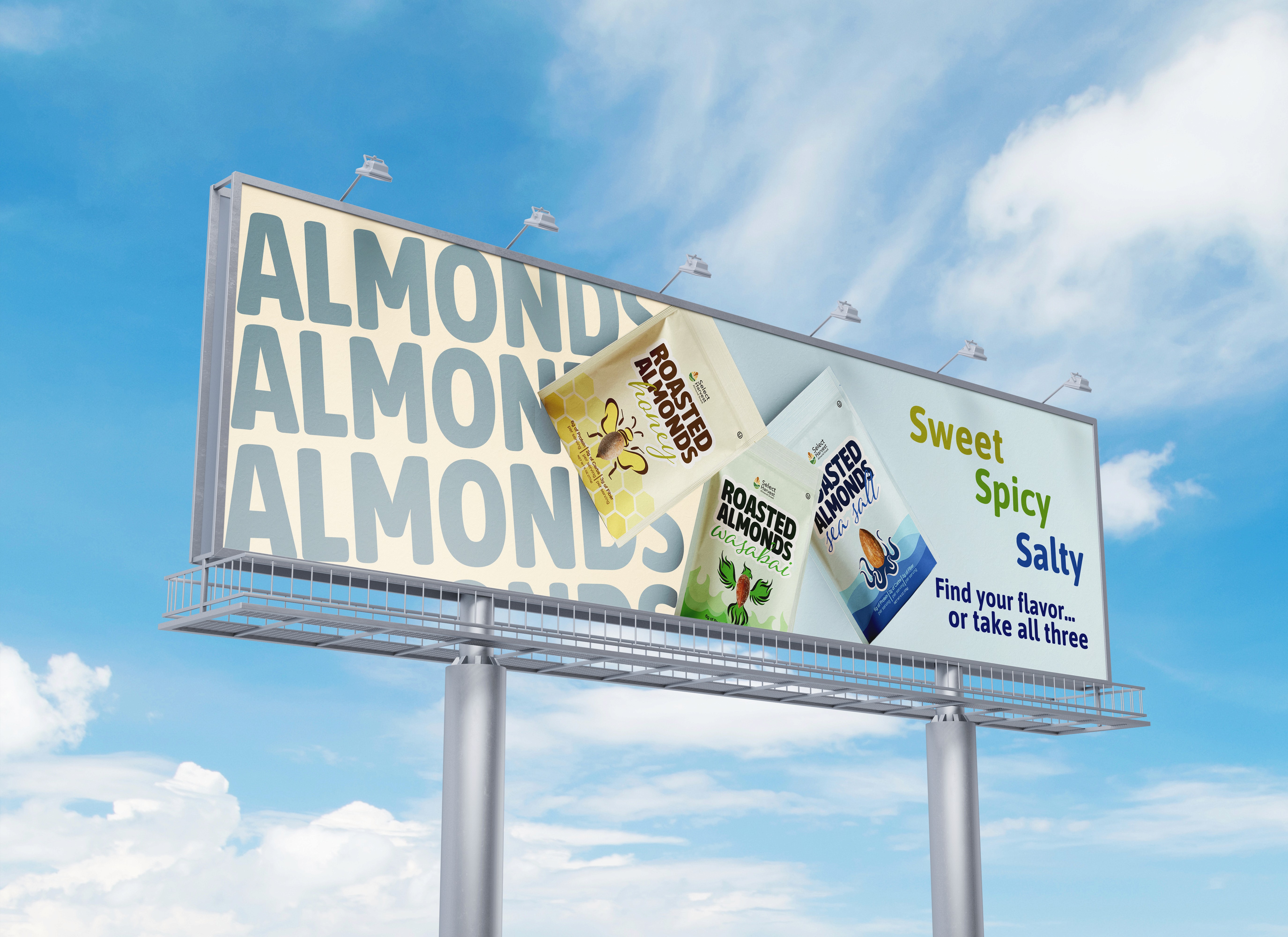
The design concept was to create a redesign for Select Harvest Almond Snacks packaging and brand identity. The challenge was to design packaging for three unique almond flavors: Honey, Sea Salt, and Wasabi. I wanted the packing to feel bold, fun, and eye-catching while still communicating the product clearly. I designed the packaging to stand out on shelves against competitors by using playful illustrations as well as strong color themes, and flavor-inspired visuals. Each package was designed around a custom illustrated character using an almond shape as the main focus. For Sea Salt, I illustrated an octopus with waves in the background; for Honey, I created a bee with honeycomb elements; and for Wasabi, I designed a phoenix with flames to emphasize the flavor. The redesign also included creating a completely new Select Harvest logo that featured a harvest field and sunset shaped like an almond to connect the branding back to nature and agriculture.
Audience
The audience for Select Harvest Almond Snacks includes health conscious consumers looking for a flavorful and convenient snack option. The brand appeals to young adults, and families. The packaging was designed to attract customers through the bright colors, playful illustrations, and strong shelf presence.
Goal
The goal of the Select Harvest redesign was to create a brand identity that emphasizes the flavors through the packaging while remaining cohesive across all packaging and advertising materials. The custom illustrations, bold flavor inspired color palettes, creates a fun and engaging packaging that communicates each almond flavor. The packaging was designed to help Select Harvest stand out within the competitive snack food market.
Research
I researched almond and nut snack packaging. I discovered that many competitors on photography and minimal layouts, which inspired me to take a more illustrated and take a character driven approach to make the packaging feel unique and playful. I also researched flavor associations and color psychology to help reinforce each product flavor visually. This research lead me to create distinct color themes for each package, yellow for Honey, blue for Sea Salt, and green for Wasabi, along with custom background graphics like honeycombs, waves, and flames to further emphasize the flavor experience.