Design Concept
The design challenge was to create a dynamic wellness branding system for CoreWell that could visually represent four different areas of health while still maintaining one cohesive identity. The system needed to feel modern, flexible, and engaging across multiple applications such as banners, social media, merchandise, and promotional materials.
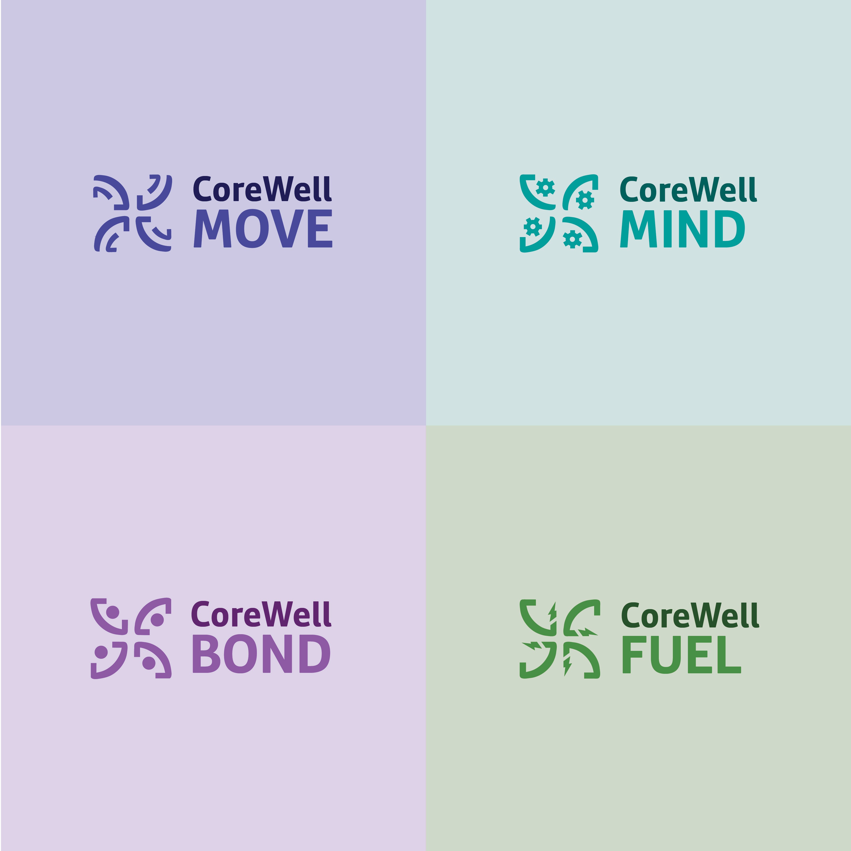
The CoreWell identity was divided into four categories: Mind, Bond, Move, and Fuel. Each section uses its own symbolic graphic language to communicate its purpose while still fitting within the larger brand system. Mind uses gears to represent how the mind works and mental wellness. Bond uses an abstract curved shape that symbolically represents a person raising their hands to show connection and community. Move uses outward-pointing arrows to communicate motion, action, and energy. Fuel uses lightning bolts to symbolize strength, nutrition, and power.
One of the biggest challenges was balancing consistency with individuality. Each logo variation needed to feel visually unique while still clearly belonging to the CoreWell brand. Another challenge was creating a system that could appeal to a broad audience ranging from working professionals to retirees and families while remaining approachable, motivating, and easy to understand.
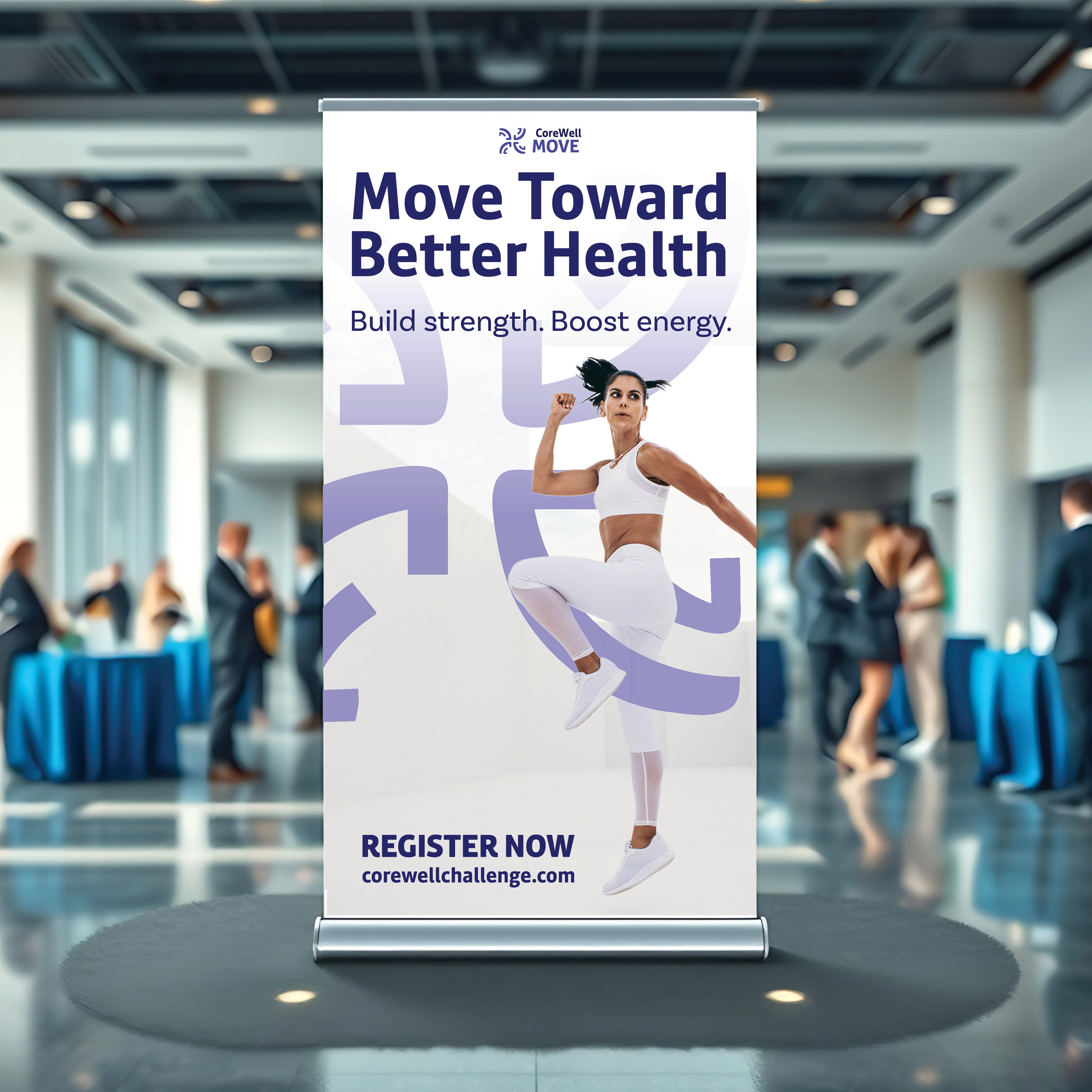
For the CoreWell Move promotion banner, I intertwined the logo with the imagery so the design feels more active and energetic. I used strong contrast, movement-based visuals, and open spacing to create a layout that grabs attention while guiding the viewer’s eye naturally through the information.
Audience
The target audience for CoreWell includes working professionals in education, retirees, and dependents participating through family involvement. More specifically, the branding was designed for individuals looking to improve their physical health, mental wellness, nutrition, and community connection through year-round wellness programs and activities.
The visual system needed to connect with a wide age range and diverse lifestyles, so the branding was designed to feel energetic, welcoming, and accessible. The clean layouts and symbolic graphics help make the information easy to understand while still feeling modern and visually engaging.
The campaign especially appeals to people seeking balance in their everyday lives by encouraging healthier habits, stronger relationships, physical activity, and overall wellness.
Goal
The goal of the CoreWell branding project was to create a flexible and recognizable identity system that reflects the evolving nature of wellness while maintaining consistency across all four campaign themes. Through typography, symbolic graphics, and layout design, I aimed to create a system that feels cohesive, motivational, and adaptable across multiple touchpoints.
Another major goal was to visually communicate the idea that wellness is interconnected. Instead of treating health as one single idea, the branding system shows how mental health, physical activity, nutrition, and social connection all work together to support a healthier lifestyle.
For the CoreWell Move campaign materials, I focused on creating energetic visuals that encourage engagement and participation. The banner, social media assets, and branded merchandise were designed to feel active and motivating while still remaining clean and easy to read. By combining movement-inspired imagery with strong visual hierarchy and open layouts, the system creates a unified experience that reinforces wellness as something active, connected, and part of everyday life.
Research
I researched wellness campaigns, fitness branding systems, and health initiatives that use adaptable identity systems across multiple categories and audiences. I discovered that many successful wellness brands rely on simple symbolic graphics, bold typography, and flexible visual systems to create recognition while allowing different campaign themes to stand apart.
I also researched how movement, connection, energy, and mindfulness are represented visually through branding and advertising. This inspired the use of arrows, gears, lightning bolts, and abstract human-inspired forms throughout the CoreWell system. These symbols helped create a stronger visual connection between each wellness category and its message.
I took noticed of how health and wellness campaigns encourage participation through motivational messaging, community-focused visuals, and branded experiences. This research helped guide my design decisions and allowed me to create a cohesive identity system that feels modern, approachable, and adaptable across banners, social media, merchandise, and event materials while reinforcing the idea of wellness as part of everyday life.